Experimenting with Thread Colors in Bookbinding
The beauty of handmade books extends far beyond the paper and cover materials. Often overlooked, yet incredibly impactful, is the color of your thread. While neutral tones like linen or cream are classic and elegant, experimenting with thread colors can truly elevate your bookbinding projects, adding a unique and personalized touch. This article explores how different thread colors can dramatically affect the look of your handmade books, offering inspiration and practical ideas.
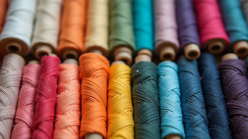
Why Thread Color Matters
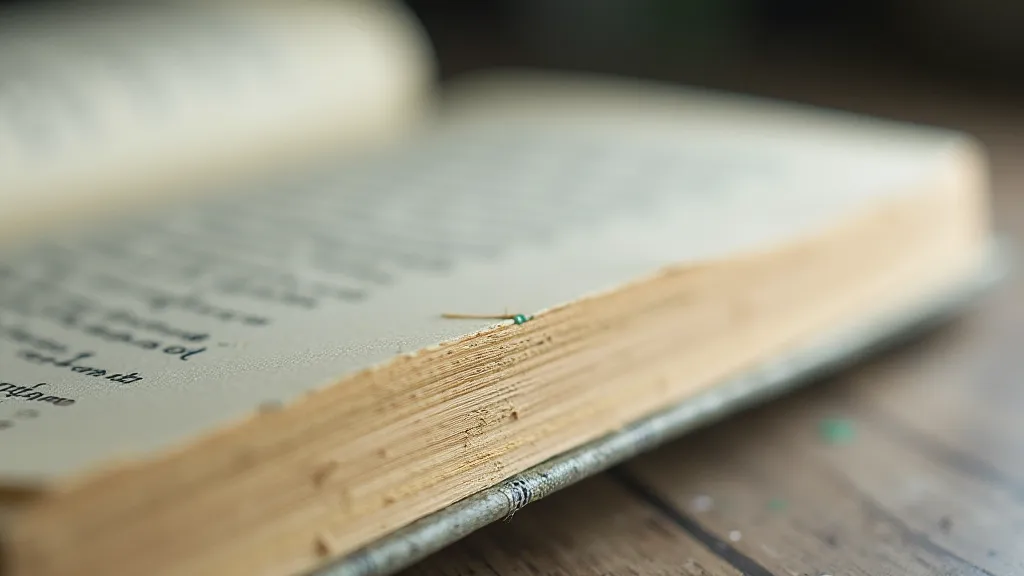
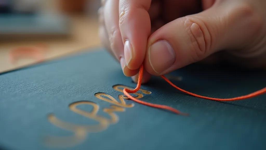
The thread isn't just a functional element holding your book together; it's a visual accent. Its color interacts with the paper, cover, and overall aesthetic. A contrasting thread color can draw attention to the stitching, emphasizing the handmade nature of the book. A coordinating color can create a cohesive and unified look. Consider these points:
- Contrast vs. Harmony: Do you want the stitching to pop or blend in?
- Mood & Style: Warm colors (reds, oranges, yellows) evoke a feeling of warmth and vibrancy. Cool colors (blues, greens, purples) suggest calmness and sophistication.
- Material Interaction: The thread color will appear different depending on the color of the paper and cover. A deep blue thread will look much darker on cream paper than on black paper.
Color Palette Inspiration
Here are some ideas to get your creative juices flowing:
Monochromatic & Neutral
Sticking within a single color family (monochromatic) or using neutral tones is a safe and elegant starting point. Think varying shades of grey, brown, or even a subtle hint of green. These work beautifully with natural paper and leather covers.
Complementary Colors
Complementary colors sit opposite each other on the color wheel (e.g., red and green, blue and orange). Using a complementary thread color against a colored paper or cover creates a striking contrast that is undeniably eye-catching. Just be mindful of the intensity – sometimes a muted version of the complementary color works better.
Analogous Colors
Analogous colors are those that sit next to each other on the color wheel (e.g., blue, blue-green, and green). These create a harmonious and soothing visual effect. Think of a book with blue-green paper and a blue thread – it’s incredibly calming and aesthetically pleasing.
Unexpected Combinations
Don’t be afraid to break the rules! Experiment with unexpected color combinations. A bright pink thread on a traditional brown leather cover can create a surprisingly delightful and unique look.
Practical Tips for Choosing Thread Color
- Swatch Test: Before committing to a large project, sew a small sample page using the thread color you're considering. This will give you a better idea of how it looks in real life.
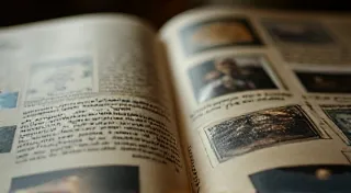
- Consider the Paper: The paper’s texture and color will significantly influence how the thread appears. Rough, textured paper will show off the thread color more than smooth paper.
- Cover Material Matters: Thread color interacts differently with leather, cloth, and paper covers. Consider this relationship when planning your color scheme.
Beyond Single Colors: Mixing & Matching
While using a single thread color is common, you can also experiment with mixing and matching colors within a single book. This technique can add depth and visual interest. For example, you could use one color for the spine stitching and another for the text block. However, proceed with caution – too many colors can look chaotic.
Final Thoughts
Experimenting with thread colors is a fantastic way to personalize your handmade books and express your creativity. Don't be afraid to try new things and see what works best for your aesthetic. The seemingly small detail of thread color can make a significant difference in the overall beauty and impact of your bookbinding projects.